如何使用Python修改matplotlib.pyplot.colorbar的位置以对齐主图
matplotlib作为Python常见的二维图形,那么,怎么去使用Python修改这类的二维图形呢?比如,去修改matplotlib.pyplot.colorbar的位置,让其做好对应工作,保证相关的位置对齐,以此用来进行对齐主图,具体下面给大家解答。 问题描述 像这样的图,我想把右边的colorbar设置成和主图一
来源: https://www.ucloud.cn/yun/128431.html 作者: 89542767 发布日期: 发布于2022-12-15 15:13
matplotlib作为Python常见的二维图形,那么,怎么去使用Python修改这类的二维图形呢?比如,去修改matplotlib.pyplot.colorbar的位置,让其做好对应工作,保证相关的位置对齐,以此用来进行对齐主图,具体下面给大家解答。
问题描述
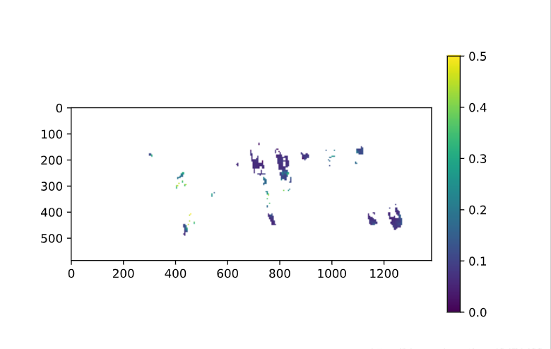
像这样的图,我想把右边的colorbar设置成和主图一样高度
方法
0.plt.colorbar参数介绍
1.plt.colorbar(im,fraction=0.046,pad=0.04,shrink=1.0)
fraction可以从0.035-0.046调节以找到合适大小
但当图像的长、高对比过大时,可能不起作用
2.make_axes_locatable
这是matplotlib包里的一个函数
  from mpl_toolkits.axes_grid1 import make_axes_locatable
  im=plt.imshow(data)
  divider=make_axes_locatable(plt.gca())
  cax=divider.append_axes("right",size="5%",pad="3%")
  plt.colorbar(im,cax=cax)
不适用于有投影参数的axe(会报错),如cartopy的GeoAxes
3.make_axes_locatables升级版
  https://stackoverflow.com/questions/18195758/set-matplotlib-colorbar-size-to-match-graph Matthias
  import matplotlib.pyplot as plt
  from mpl_toolkits import axes_grid1
  def add_colorbar(im,aspect=20,pad_fraction=0.5,**kwargs):
  """Add a vertical color bar to an image plot."""
  divider=axes_grid1.make_axes_locatable(im.axes)
  width=axes_grid1.axes_size.AxesY(im.axes,aspect=1./aspect)
  pad=axes_grid1.axes_size.Fraction(pad_fraction,width)
  current_ax=plt.gca()
  cax=divider.append_axes("right",size=width,pad=pad)
  plt.sca(current_ax)
  return im.axes.figure.colorbar(im,cax=cax,**kwargs)
用法示例
  im=plt.imshow(np.arange(200).reshape((20,10)))
  add_colorbar(im)
4.手动给colorbar添加一个axe
https://stackoverflow.com/questions/18195758/set-matplotlib-colorbar-size-to-match-graph Fei Yao
  import matplotlib.pyplot as plt
  import numpy as np
  fig=plt.figure()
  ax=plt.axes()
  im=ax.imshow(np.arange(100).reshape((10,10)))
  #Create an axes for colorbar.The position of the axes is calculated based on the position of ax.
  #You can change 0.01 to adjust the distance between the main image and the colorbar.
  #You can change 0.02 to adjust the width of the colorbar.
  #This practice is universal for both subplots and GeoAxes.
  cax=fig.add_axes([ax.get_position().x1+0.01,ax.get_position().y0,0.02,ax.get_position().height])
  plt.colorbar(im,cax=cax)#Similar to fig.colorbar(im,cax=cax)
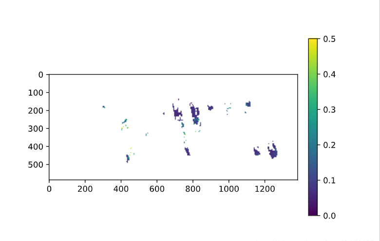
效果展示
综上所述,这篇文章就给大家介绍到这里了,希望可以给大家带来更多帮助。